Attention to Detail
Sometimes you just have to wonder how the things that show a lack of attention to detail can make it to production. Especially when there are sooo many eyeballs that would have looked over something before it’s release.
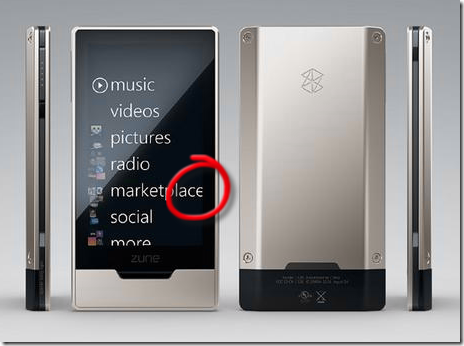
Notice anything suspect about the latest Zune HD marketing shots? Hint: It’s inside the circled area :-)
A font clipping problem? Seriously?! Why wouldn’t you just reduce the font size by a tiny fraction so that the default text actually fits cleanly. It’s not that hard a problem surely? And now that I’ve seen that I’m wondering if the device is actually too narrow and whether other software will also experience the same clipping problem.
And then I start wondering, why on earth would you use an image with clipping problems as a promotional picture? I can’t imaging Apple letting something like that slip through.
